
UX/UI Design
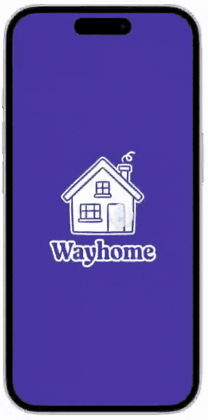
Wayhome
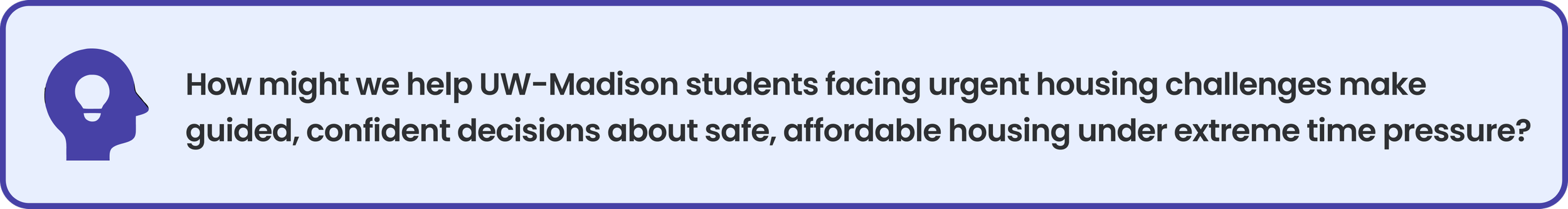
A housing navigator for UW-Madison students who can't afford to wait.
About This Project
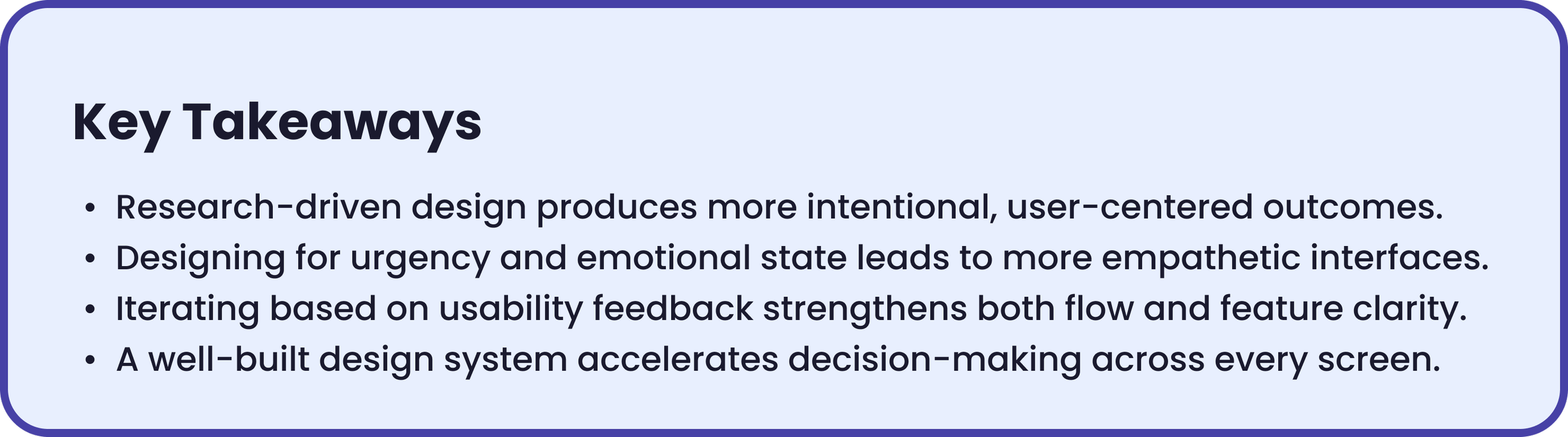
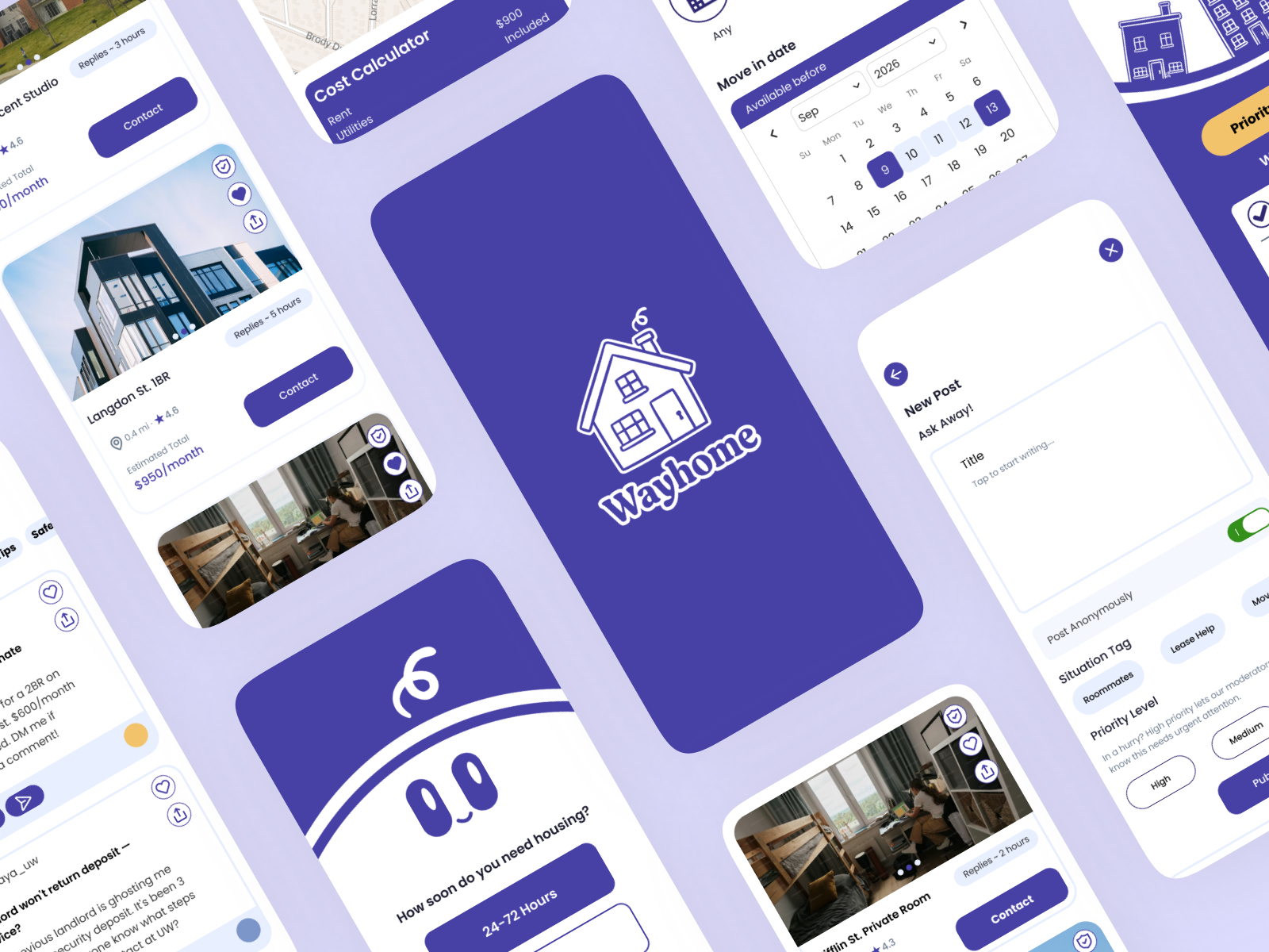
WayHome is a high-fidelity mobile app prototype designed to meet UW-Madison students at every stage of their housing search. Built around three urgency modes and grounded in real student research — 302 surveys, 3 in-depth interviews — it transforms a stressful, high-stakes process into one that feels manageable and human.
Year
Spring 2026
UX Designer, UX Researcher, Design Systems
Role
Tools
Figma , Adobe Illustrator
The Challenge
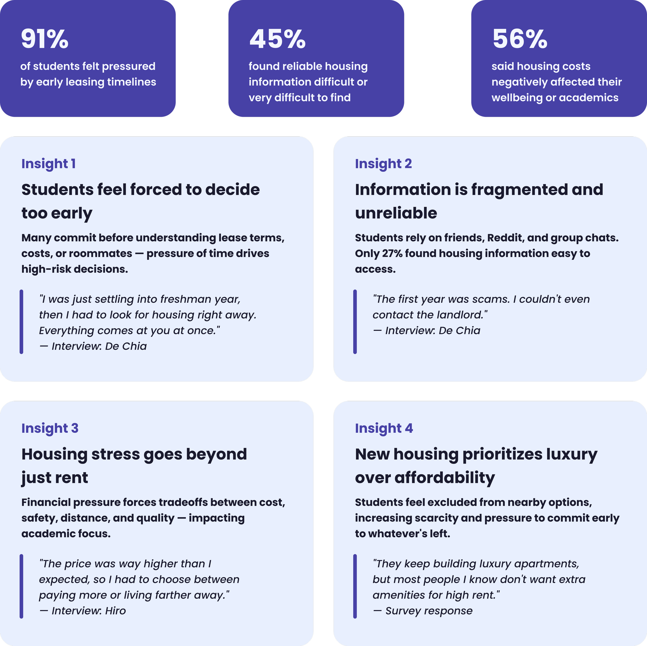
Students weren't failing to find housing, they were being pushed to commit before they were ready. Fragmented information, early leasing pressure, and no guidance calibrated to their timeline made the process stressful and inaccessible.
The Solution
WayHome adapts to where you are in the search. Priority Match for students in crisis, Guided Search for those with time, and Just Browsing for early explorers. Each mode was a direct response to the research finding that 91% of students felt forced to decide before they were ready. Verification badges and response time tags came from interview findings about landlord distrust. The community tab existed because students were already turning to Reddit and group chats, the research just made it impossible to ignore.
The Outcome
An interactive prototype across three complete task flows, built on a realized design system with Poppins typography, a purple and amber palette, and component variants across every screen state.
Design Process
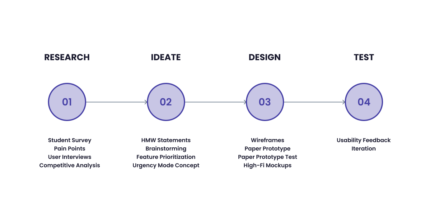
Research Findings
Storyboarding
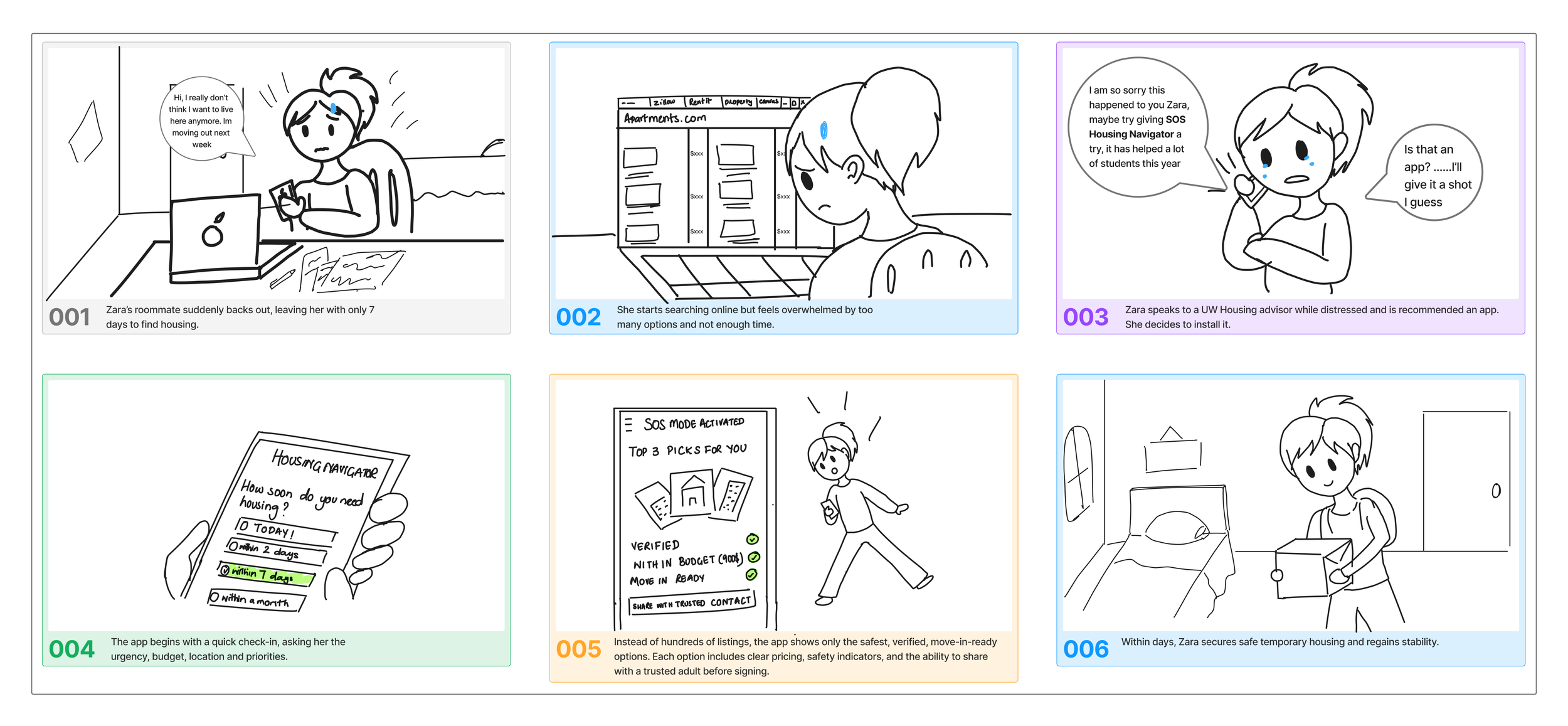
I had fun storyboarding after the brainstorming process , it helped me empathize with the user and imagine what it would really be like to be a distressed student with 7 days to find housing.
Task Flows
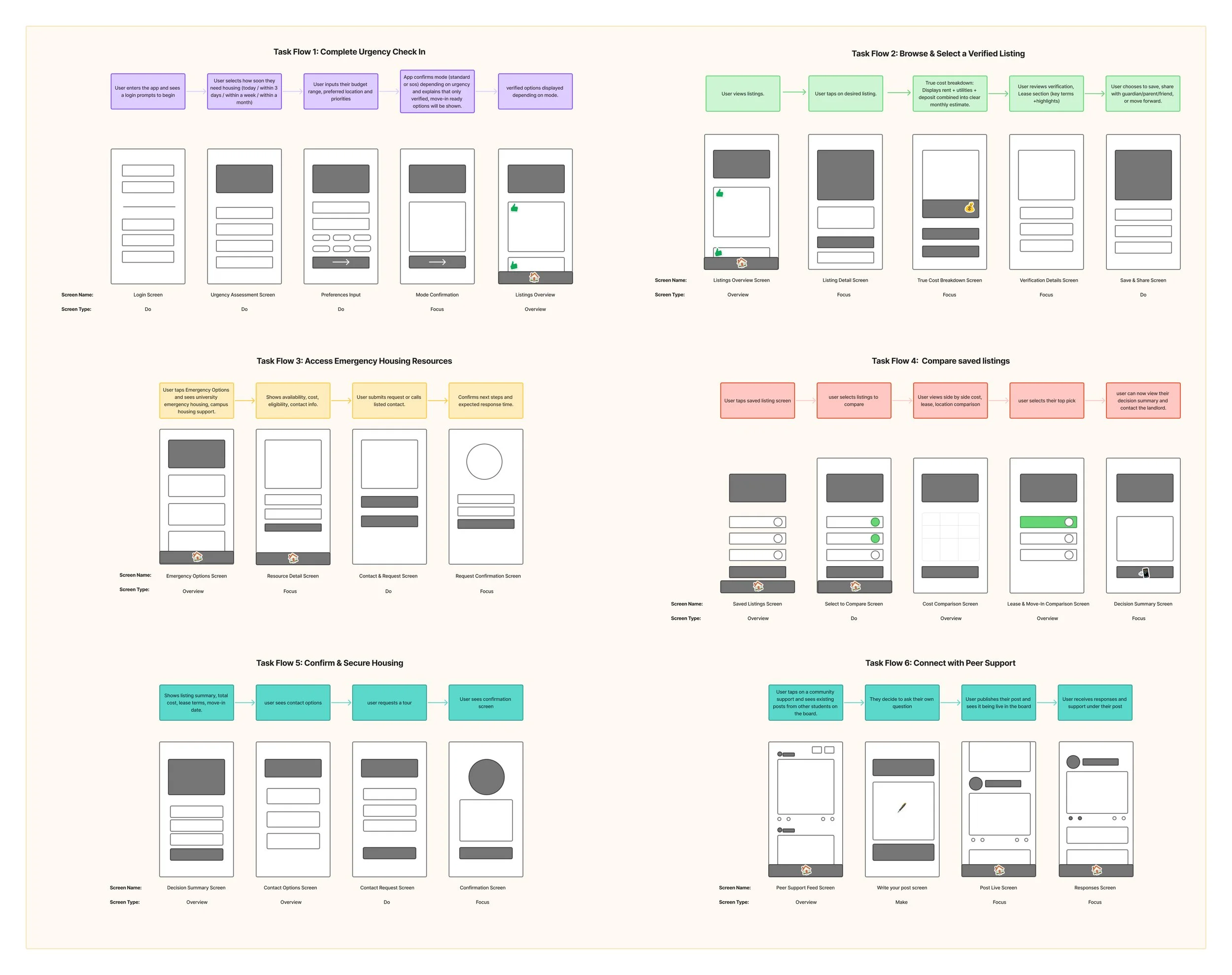
Mapping out six task flows helped narrow down the core functions of the app, cutting features that overcomplicated the experience and focusing on what students actually needed to do under pressure while looking for housing.
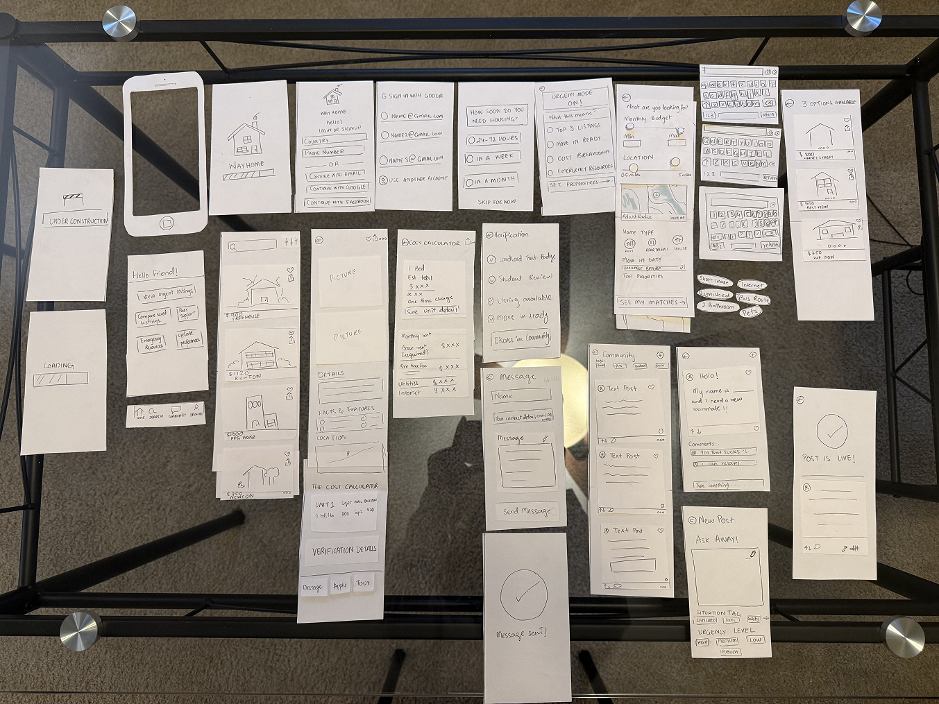
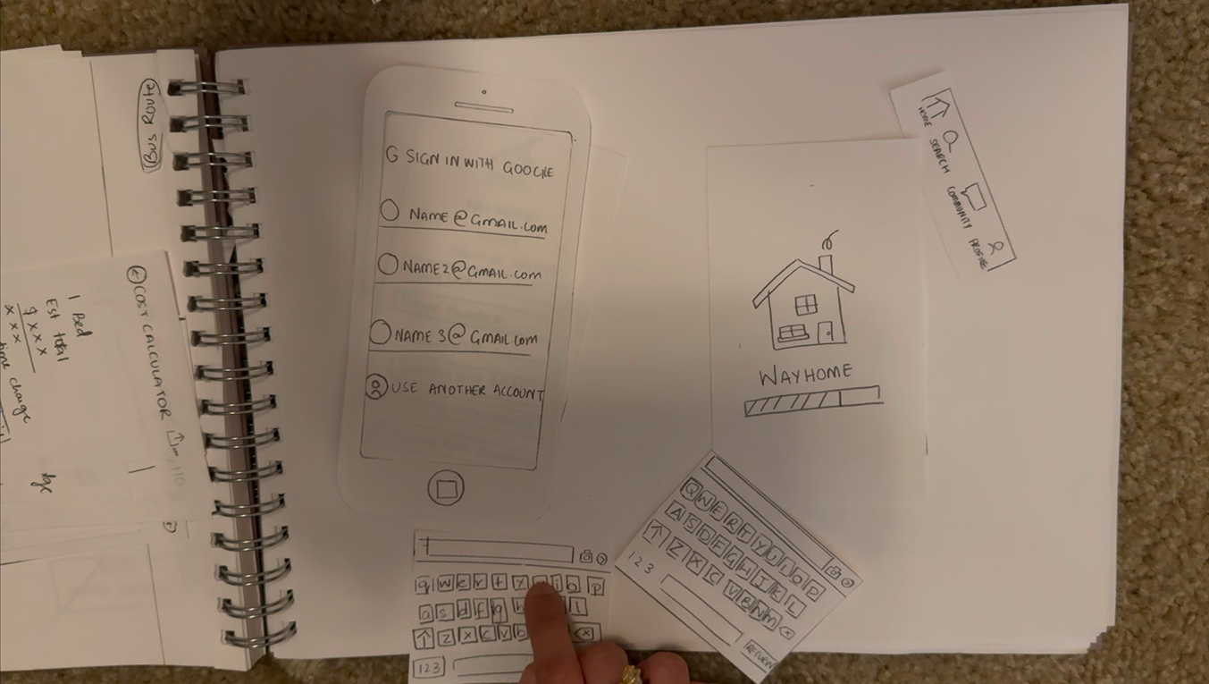
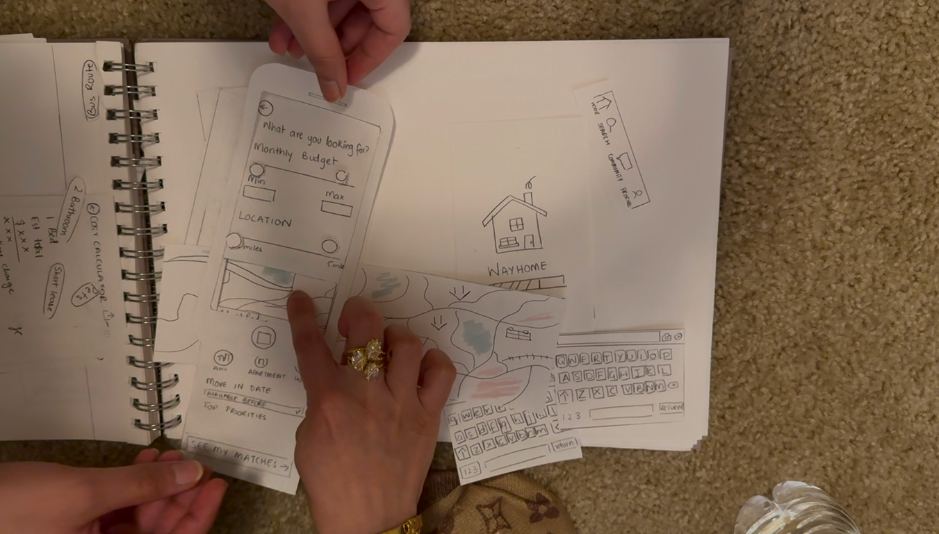
Paper Prototyping
Paper prototyping with 2 UW-Madison students revealed where the design needed to change; verification badges needed to appear earlier, the search bar worked better at the top, and the Community tab icon needed to be clearer.
Lo-Fi Wireframing
Lo-fi wireframing helped translate the task flows into actual screens, forcing decisions about layout, hierarchy, and navigation that sketches alone couldn't answer.
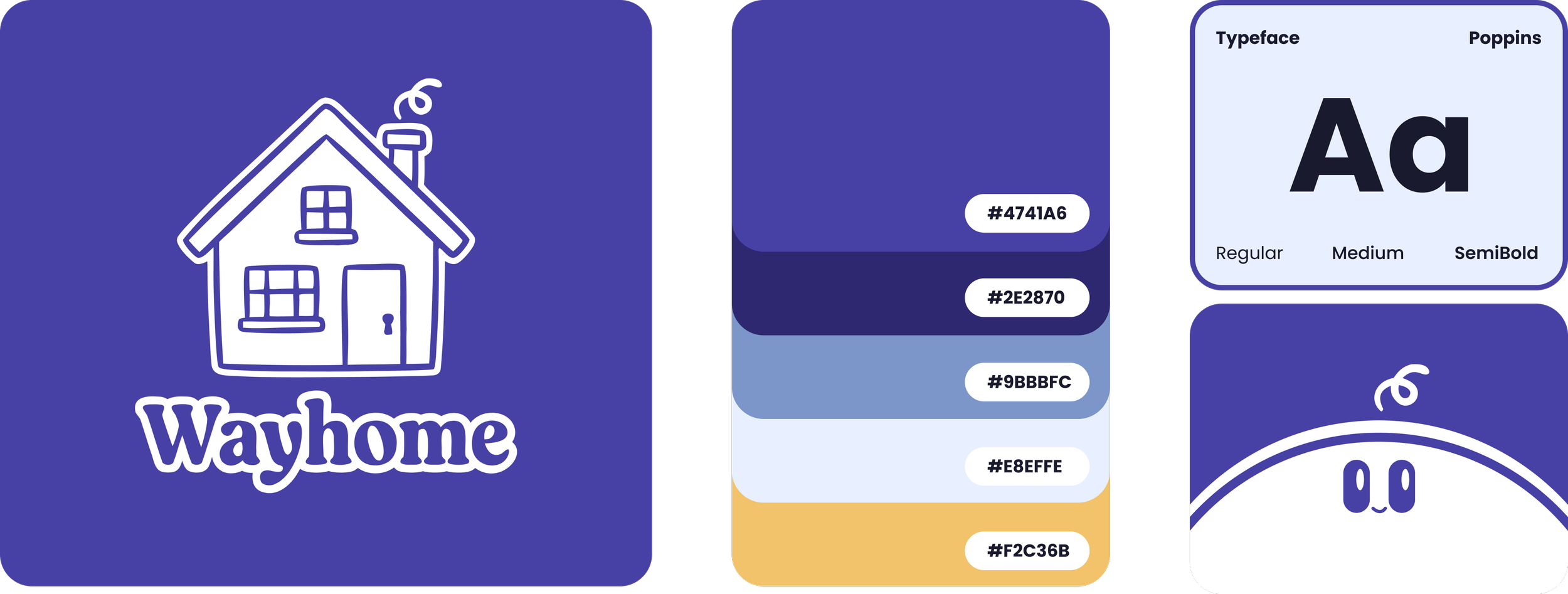
Brand Identity
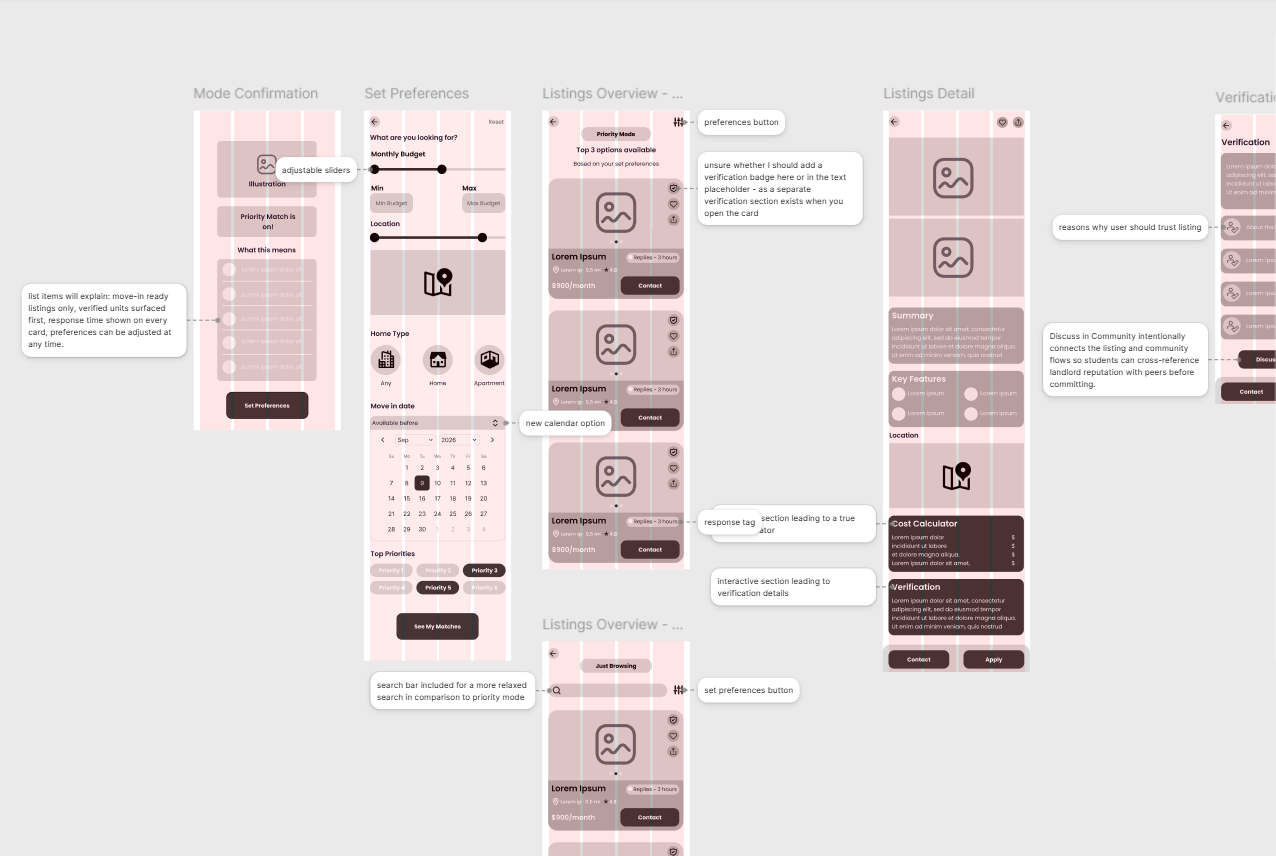
The Prototype
At the end, I made a high-fidelity interactive prototype in Figma across three complete task flows:
urgency check-in
browsing and selecting a verified listing
connecting with peer support.
The goal was to validate that a housing tool could adapt to a student's urgency level while still feeling intuitive, trustworthy, and human.